
BOISE, Idaho — When Boise State takes the field Friday night inside Albertsons Stadium, the Broncos will don an all-blue uniform combination, highlighted by a fan favorite throwback helmet.
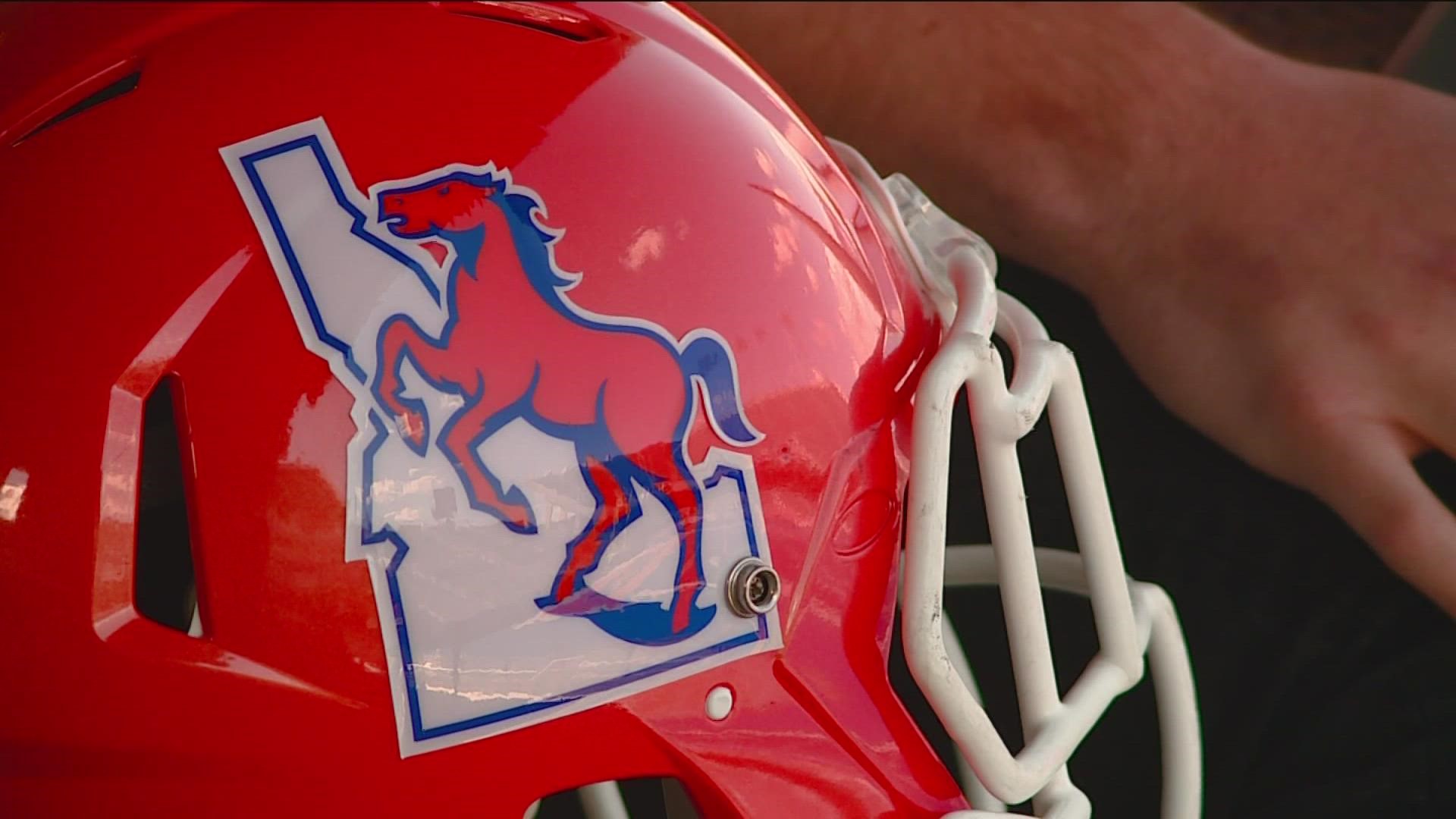
On Tuesday, Boise State football announced it was rocking helmets with the Bronco + Idaho logo. The logo with a white State of Idaho emblem and orange Bronco was redesigned in 2021 when Boise State wore all orange.
Graphic designer and Boise State University alum Daniel Saline helped create the redesigned logo. Saline told KTVB the project's goal was to design a timeless logo with the capability of leaving a lasting impact.
"There's a bunch of different projects that you see around the building that you know are going to outlast you, no matter how long you think you're going to be here. This helmet sticker I hope is one of them," Saline said. "We had it in mind that we were going to wear it for a couple of football seasons at least and get some merchandise, really get its run, so to see it again is pretty sweet. We knew we wanted to get this right, which means every detail has to be perfected."
More than 35 years ago, the Bronco + Idaho logo appeared on the center of Boise State's blue turf as the program gained national recognition.
The 2021 update altered the original logo, with bolder lines around the Idaho outline and a sleeker-looking Bronco. Saline said the redesign also made the logo more flexible for use outside of the helmet.
"One of the benefits of redoing this is that we could learn from the past mistakes of the logo, where some of the imperfections don't hold up, like one inch tall, like you're seeing on a polo shirt or massive like you're seeing on a video board," Saline said. "Fixing some of those use cases is something that we can do better this time around while still making sure that it's still iconic in this same logo."
"We designed it originally to be on blue, but with the purpose that it could be on any color, because it was on any color originally. I think it looks sweet on blue because that's what it was on the blue turf back when it was installed in 1986, which I think has a pretty good historical reference to it," Saline said. "Some of the details that I think were difficult to get through were the shape of the mane, the flowing parts, the tail, how the eye looks, some of the facial features weren't totally distinguishable, especially in that original logo, and how we can kind of modernize those. So, those were some of the challenges."
Saline said retracing the logo took "the better part of two weeks." Saline said he wanted to get the logo "perfect," because of the passion Bronco Nation has for its jerseys, helmets and the Boise State program entirely.
"We had to make it right, so it took a little bit of time, maybe more than it should have, but I think it worked out pretty well," Saline said. "You know, as they say, 'once a bronco, always a bronco,' and even though I'm just a graphic designer, a nerd behind a computer. I think it's pretty cool to see the impact of a logo that really gives to a fan base."
Keep up with the action Friday using KTVB's Game Tracker and live blog, which includes a live scoreboard and the latest Twitter updates from Boise State football and KTVB Sports Director Jay Tust.
Watch more on Boise State Football:
See all of our Boise State football coverage in our YouTube playlist: